Electricity Management System
Interface design for a factory energy dashboard, built around a sensor unit Vanora was making for their client.
The problem
Vanora was building a sensor unit for a factory client, and the readings coming off it needed somewhere to live.
The dashboard had to show total energy input and output across the machinery on the factory floor, so the client could see where the usage was going, optimise against it, bring maintenance cost down and keep more of the margin.
Vanora had their own developers for the build. What they were missing was the design.
Approach
Design only, scoped that way from the start, and handed to Vanora's developers to build.
Six to eight desktop screens, across about two weeks, with no research phase behind it. The data already had its shape, decided by the sensor unit and the people building it, so the brief was a clean interface over it rather than a question about what should be measured.
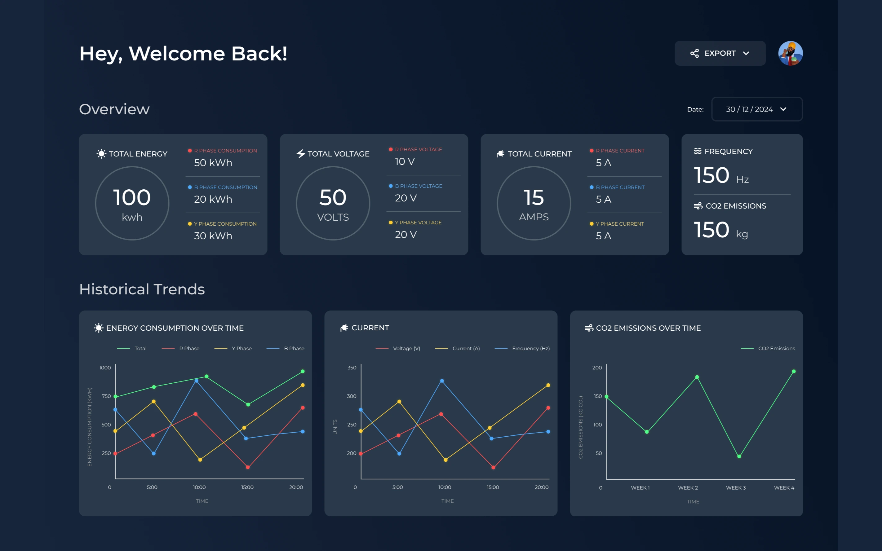
The overview carries the live reading at the top, energy, voltage and current each broken down by phase, with frequency and CO2 beside them. Underneath sit the same measures over time, so a reading can be checked against the shape of the day rather than on its own.
Each measure then opens into a view of its own. Series can be switched on and off one at a time, and the window moved between today, the last seven days and the last thirty.
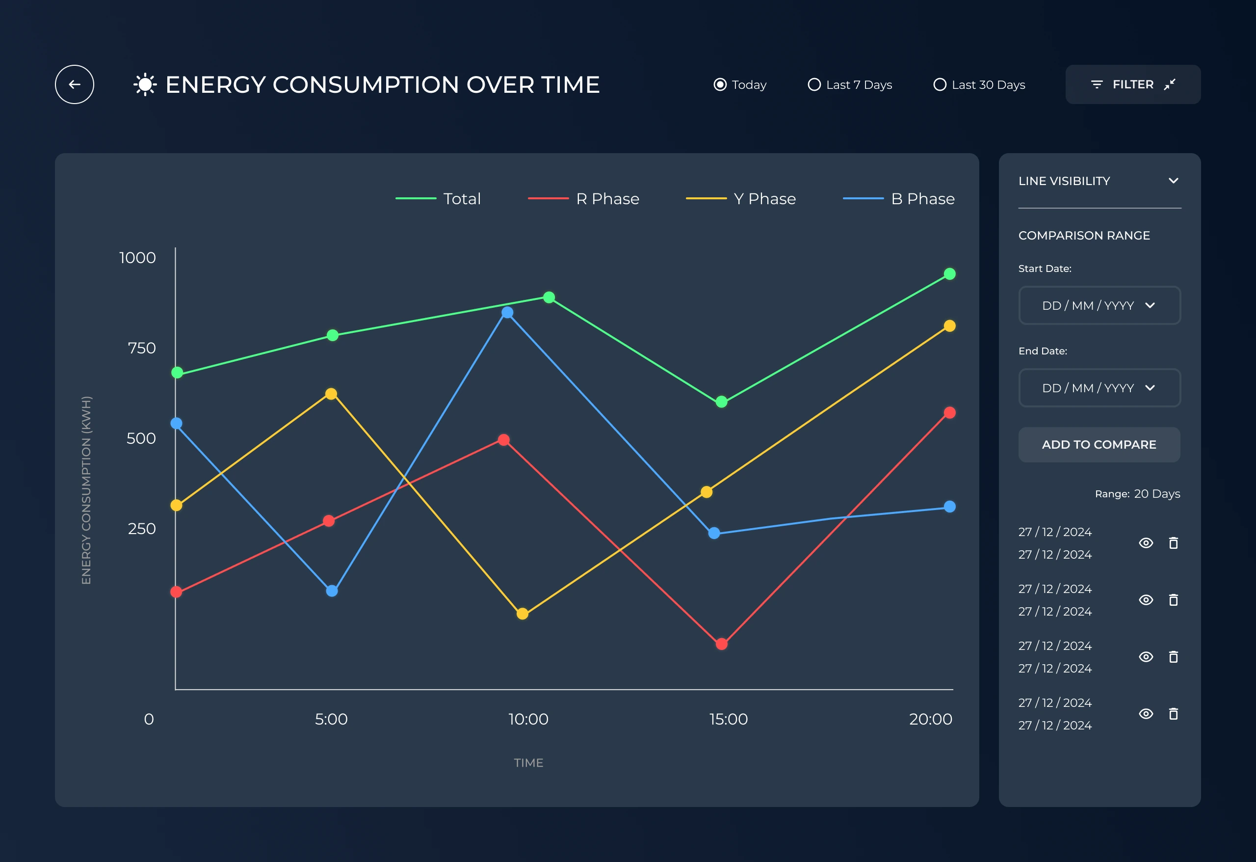
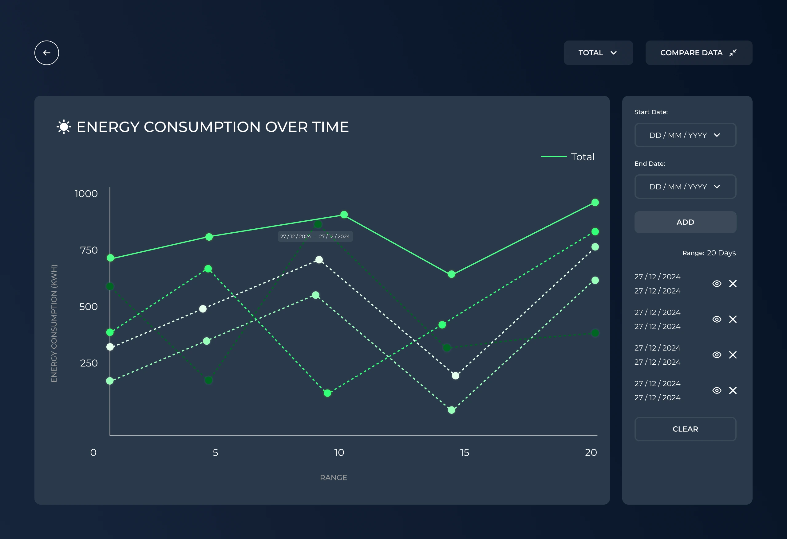
Comparison is the other half of that panel. A date range is added and the chart narrows to one series, the live stretch drawn solid and each saved range dotted behind it, so one period can be read against another without losing which is which.
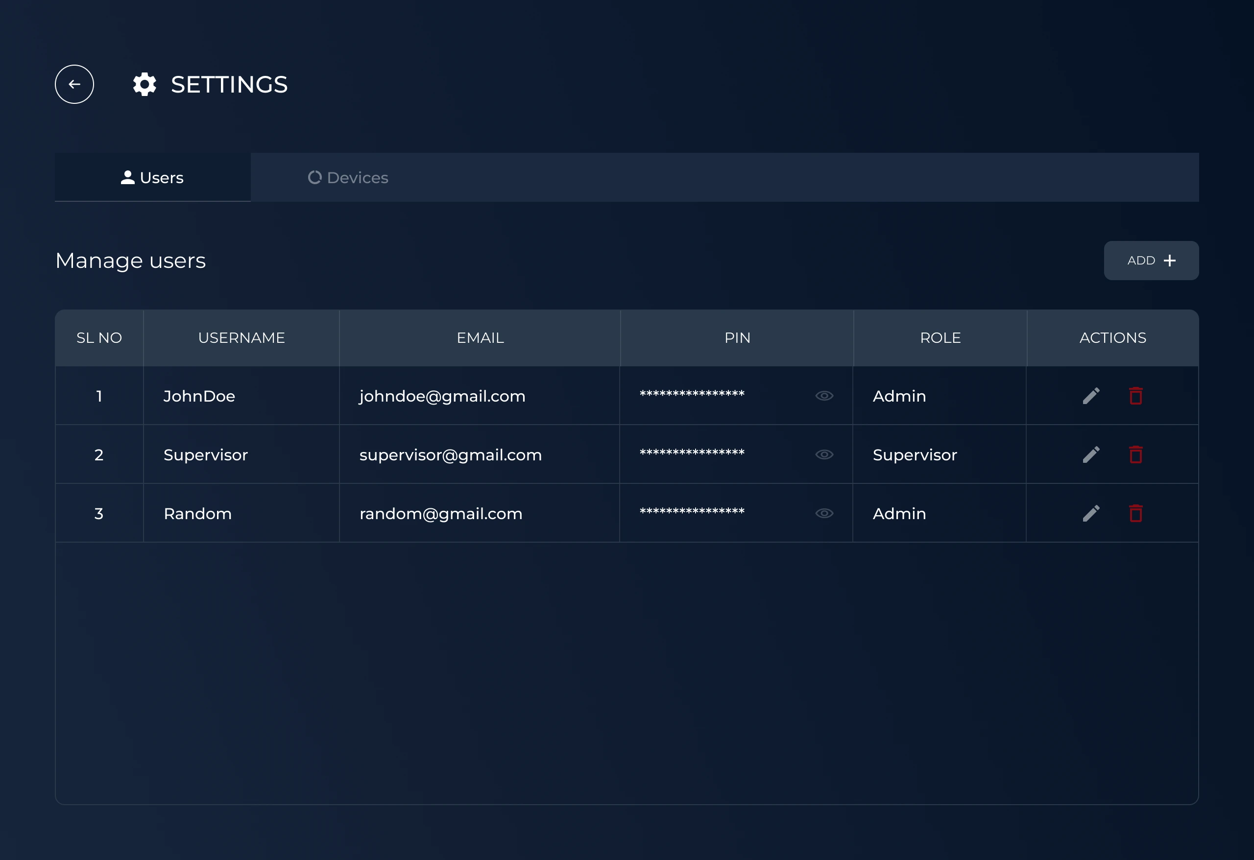
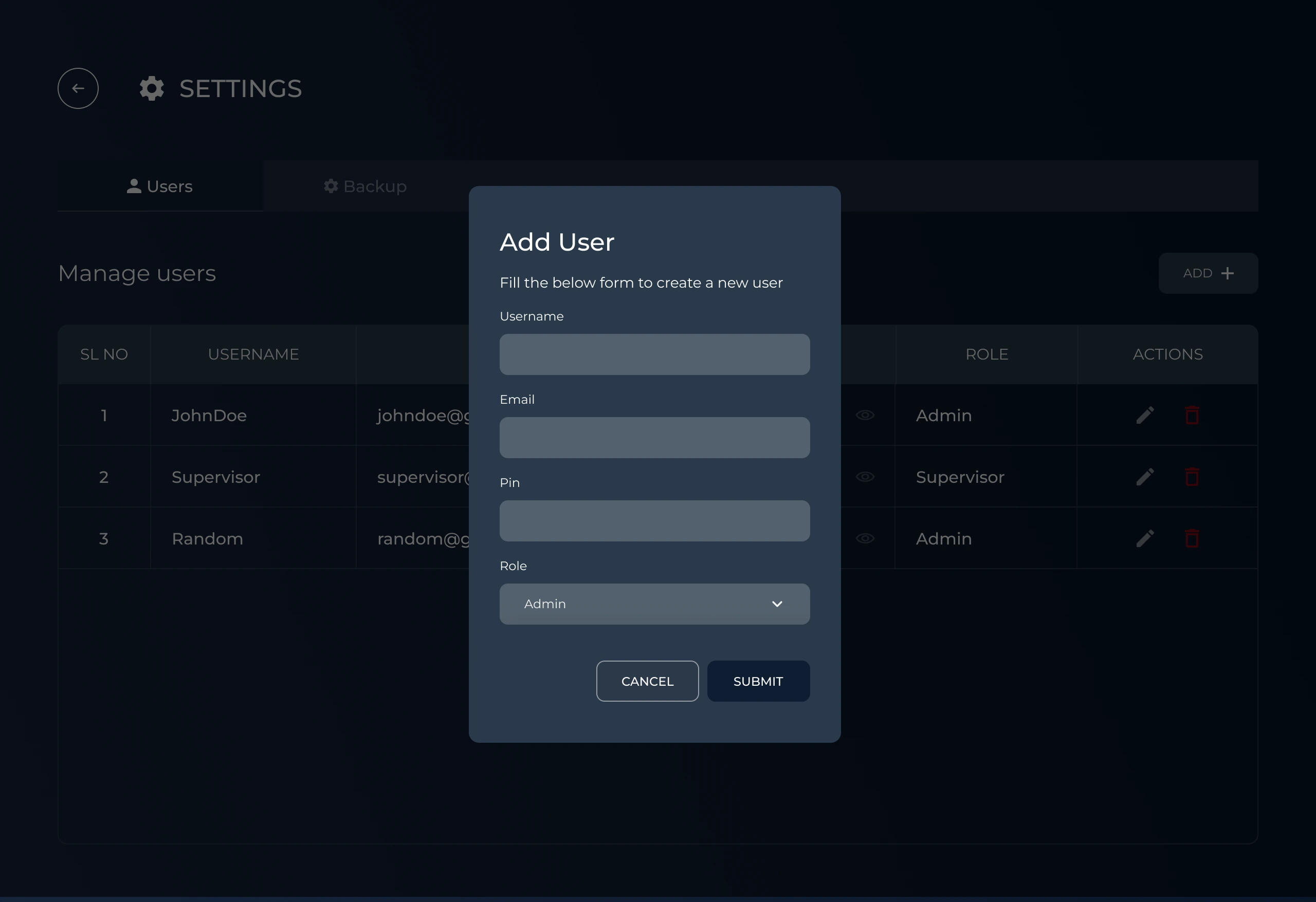
Settings splits across users and devices. A user carries a role, admin or supervisor, with a PIN held masked until it is asked for, and the list takes the usual add, edit and remove.